Mobile
Using the panel from a phone — install to the home screen, navigate with the bottom bar, check metrics, jump to anything that needs a fix, and email the people it affects.
The panel works from a phone. Nothing needs enabling and nothing extra needs installing — the same address that serves the desktop panel serves the mobile one, with the layout adapting to the screen. Quick checks and quick fixes are the point: glance at the dashboard, see what needs attention, open the thing that is wrong, act on it.
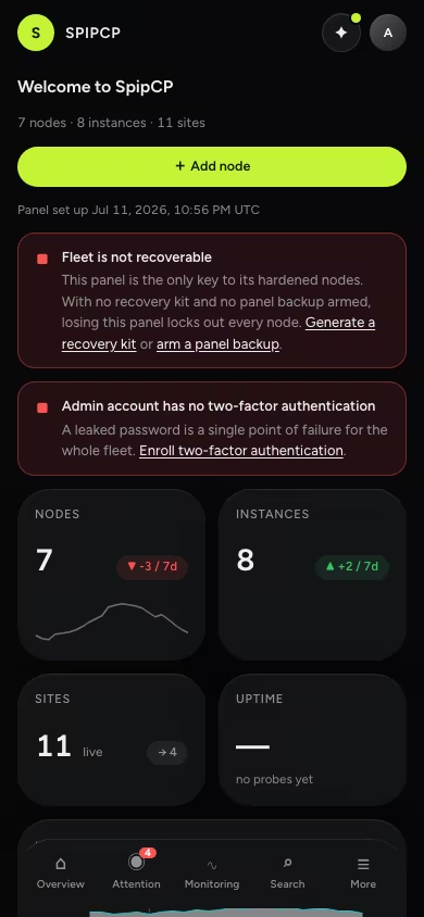
Install to the home screen
The panel is installable as an app. Installed, it opens full-screen with its own icon — no browser chrome, no address bar.
- iOS (Safari): open the panel, tap the share button, then Add to Home Screen.
- Android (Chrome): open the panel and accept the install prompt, or use menu → Add to Home screen.
The installed panel is still the live web app. It updates when the panel updates, carries no separate version, and needs no app store. Signing in works the same way; the session is shared with the browser.
The bottom bar
Below tablet width, navigation moves to a fixed bar at the bottom of the screen — the part of a phone a thumb can actually reach.
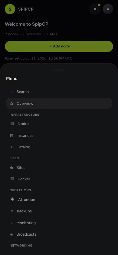
Five slots:
- Overview — the dashboard.
- Attention — everything that currently needs a fix, with a badge when something is red.
- Monitoring — the probe grid.
- Search — the command palette.
- More — the full menu: every section, settings, and the theme toggle.
The bar follows role permissions: a slot only appears if the signed-in role can see its section. The bar tucks away while typing so it never overlaps the keyboard.
Attention — the fix-it list
Attention gathers every problem the panel knows about onto one screen: probes that are down or degraded, containers that are failing, nodes that are offline, certificates that failed or expire soon, and account-level warnings such as recovery keys at risk. Each entry links straight to the surface where the fix happens — Attention is a lens over the rest of the panel, not a separate inbox, so there is nothing to mark read and nothing to keep in sync.
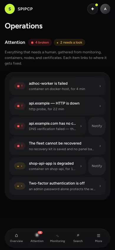
An empty Attention list is the goal state: it means every enabled probe is healthy and nothing in the fleet is asking for a human. The same view exists on desktop under Operations.
Checking metrics
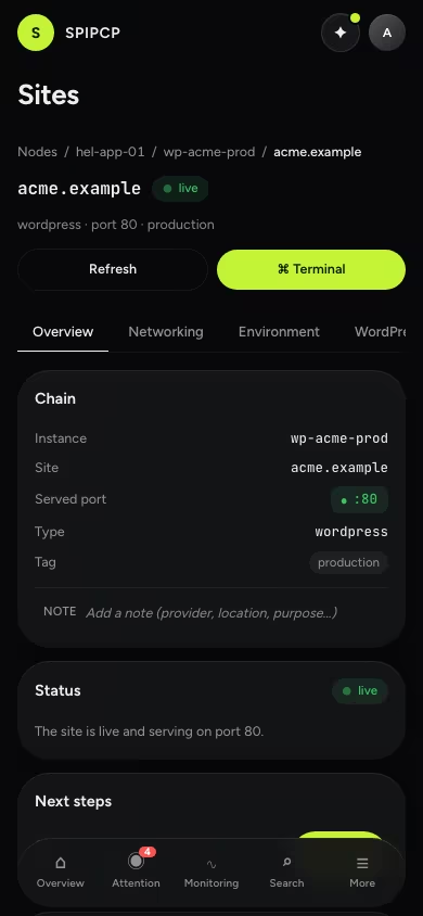
The dashboard and monitoring pages carry their full content at phone width. Tables collapse into stacked cards — one card per row, label/value pairs — and charts resize to the screen. Sparklines, gauges, and the incidents card behave exactly as on desktop, just narrower.
Broadcasts — telling the people it affects
When something breaks and the fix will take a while, the affected people can hear it from the panel directly. A broadcast is an email — subject, message, audience — sent to either panel users (all, or admins only) or site owners: the owner contacts of all sites, of the sites on one node or instance, or of a single site. Owner contacts are the addresses recorded per site for credential handoff, so "everyone with a site on this node" is a two-tap audience during an incident.
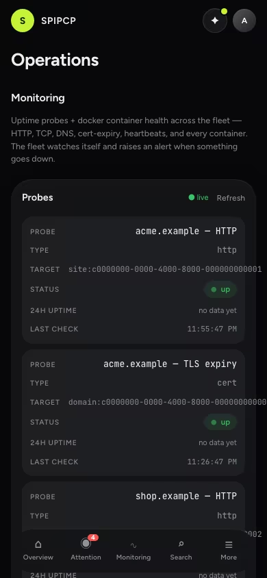
The fastest path starts from the problem itself: every Attention item carries a Notify action that opens the compose pre-scoped to that item's audience, with the subject pre-filled. Before anything sends, the panel resolves the audience and shows the exact recipient count — a broadcast never goes out on an estimate, and once sent it cannot be recalled. Past broadcasts are listed with their audience, counts, and sender as the audit trail.
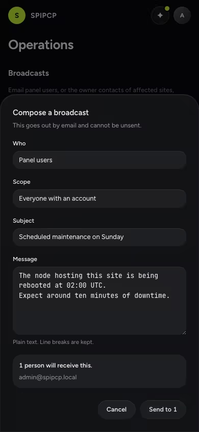
Two boundaries worth knowing: sending requires the broadcast permission (admin-only), and owner contacts exist for operational messages — outage notices, maintenance windows, migrations — not announcements or marketing. The email footer states which panel sent the message and why the address received it. Sending needs SMTP configured under settings; without it the compose stays disabled and points at the mail settings page.
What adapts
The whole panel follows the same rules, because every page is built from the same components:
- Tables become stacked cards below tablet width.
- Dialogs open as bottom sheets on phones, so the keyboard never covers the form.
- Tabs scroll sideways when they overflow instead of shrinking.
- Charts shrink in both width and height to fit the viewport.
- Terminals keep their content in a scrollable frame — long lines scroll sideways inside the terminal, never the page. A phone terminal suits a quick command and a log check; a full-screen editor session still belongs on a desktop.
Deliberately not offline
Every screen in the panel shows live fleet state, so the mobile panel does not cache an offline copy — a stored answer about a fleet stops being true the moment the connection drops. Without a connection the panel says so, plainly, instead of presenting stale data as current. Push notifications are not part of the mobile panel yet; when they arrive, they arrive as their own feature.
Recommendations
How SpipCP orders provider choices — DNS, SSL, and git — and the reasoning behind it. The short version: prefer open, self-hostable, EU/sovereign options; keep US-based platforms as a fall-back, not a default.
Nodes
Bring a server under SpipCP's control — enroll it once over SSH, harden it, and keep it converged — then manage it from the node workspace.